My Family Journal
Product design
Research
App Design
People without smartphones or an internet connection cannot access family photos shared online. My Family Journal is a cross functional product (App and web) to help family members stay connected by printing and sending automatically generated photo albums by post to loved ones
I was the sole designer on this project from problem framing to user research to design and testing a solution. I lead regular feedback sessions with users to shape the product vision as well as refine the design and overall UX.
Opportunity in Numbers
7 % of french people above 15 year old don’t have an internet access
84% of above 70 yo have a smartphone vs. 97% for the rest of the population
4 millions of french people above 60 never use internet (27% of them).
How might we help family members stay connected when they don’t own a smartphone?
Understanding the problem space
I conducted 5 Semi-structured Interviews (circa 30 minutes) with people who have relatives that don’t have easy internet access or smartphones.
Goal of initial research
Identify the main pain points regarding sharing photos with relatives that don’t have easy access to internet or smartphones,
Identify common user behaviors and experiences
Figure out how my product could help solve their pain points.
Main pain points
Time: People don’t have a lot of time to call or send images to older relatives.
Too many Photos on the phone: People have many images on their smartphones, and don’t want to spend a lot of time sorting them.
Distance : Some people are frustrated by the distance with their relatives and don’t know how to share memories with them.
App concept & Design principles
Our solution will focus on solving for elderly people since they are the ones with less internet access and who want to stay connected to their family the most.
Based on a competitor audit, I refined the concept of the product. The concept is to automatically generate a monthly journal of 30 photos, print it and send it to a recipient at a chosen address. Our App will have a monthly subscription.
Automation
We know from our research that people have little time and too many photos on their phone. Creating a photo album should be easy and require very little work.
We will start with a single photo album template and automate as much as possible the album creation process.
Support regular use
Isolated people want to receive photos on a regular basis. Our app should help to do that.
We will have a monthly membership and remind users during the user journey to upload images every month to stay connected with their loved ones.
Elderly focus
Our product is targeted to elderly people so the photo albums will be designed for them with one photo per page so that it’s easier to see for them.
We will work on partnerships with retirement houses groups and NGO in this sector to help to reduce isolation of this population.
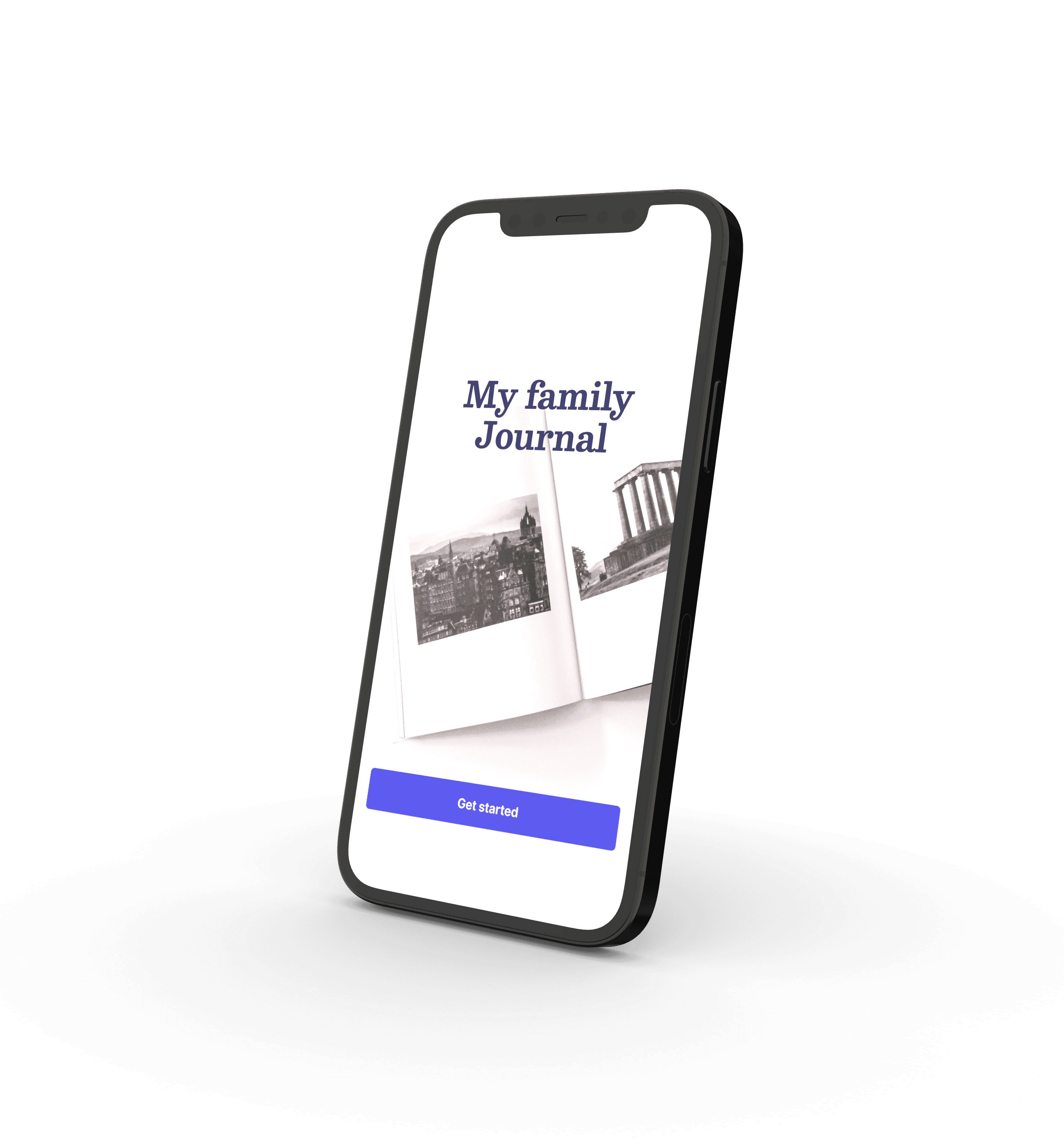
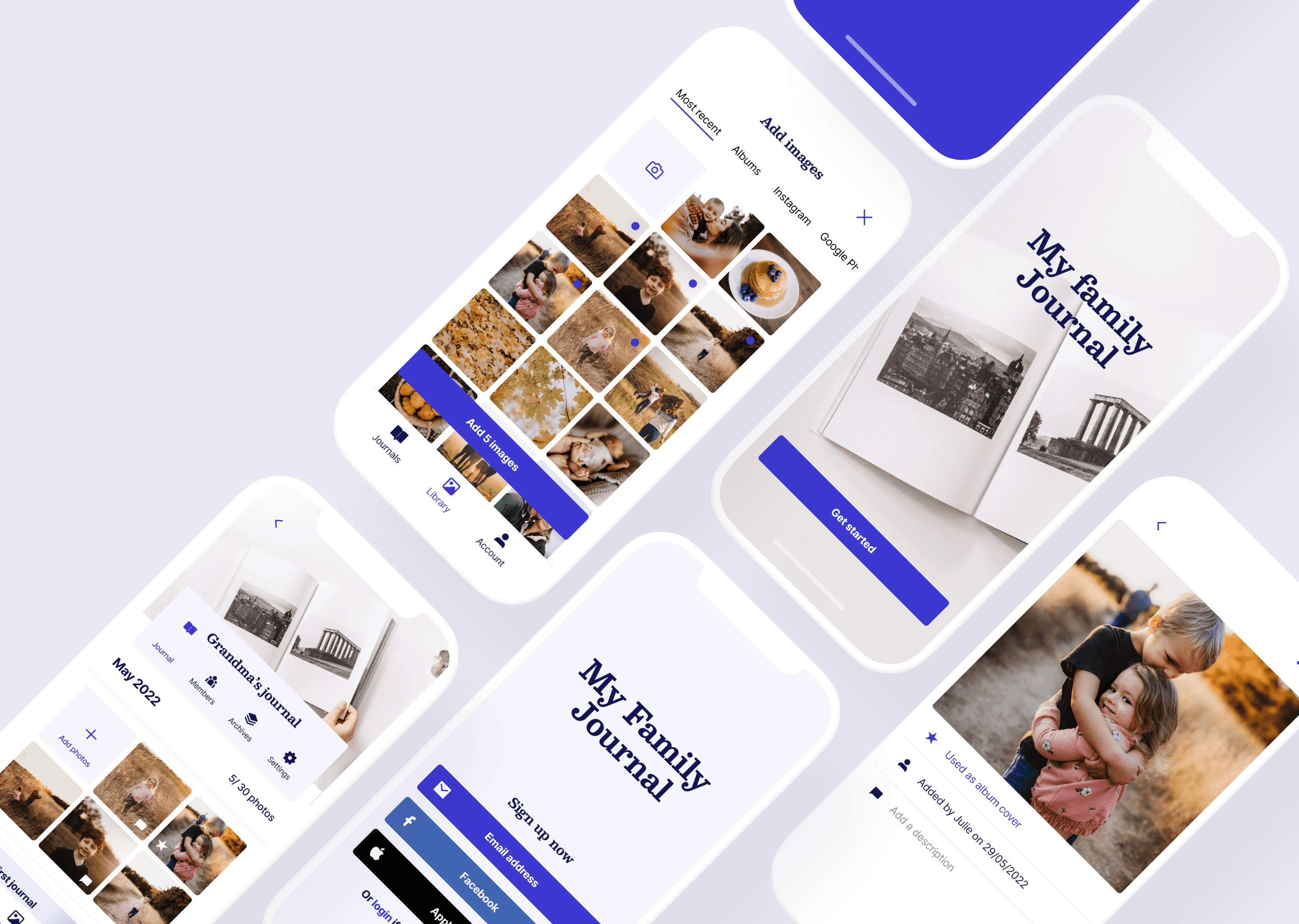
Designing a low fidelity version
During the first use, we want to show the user how easy it is to create a journal and hook him to the product. This decision impacted the user flow significantly by making the user add images to the App right away to automatically generate his first journal.
Starting by generating a journal is a decision that can lead to challenges since the user did not subscribe to a paid plan yet or added a recipient delivery address.
This design choice will need to be carefully tested with users.
I explored options in the design to overcome this challenge such as reminders inside the App to add a recipient or to subscribe as well as “Pop ups” pages offering to subscribe to a paid plan.
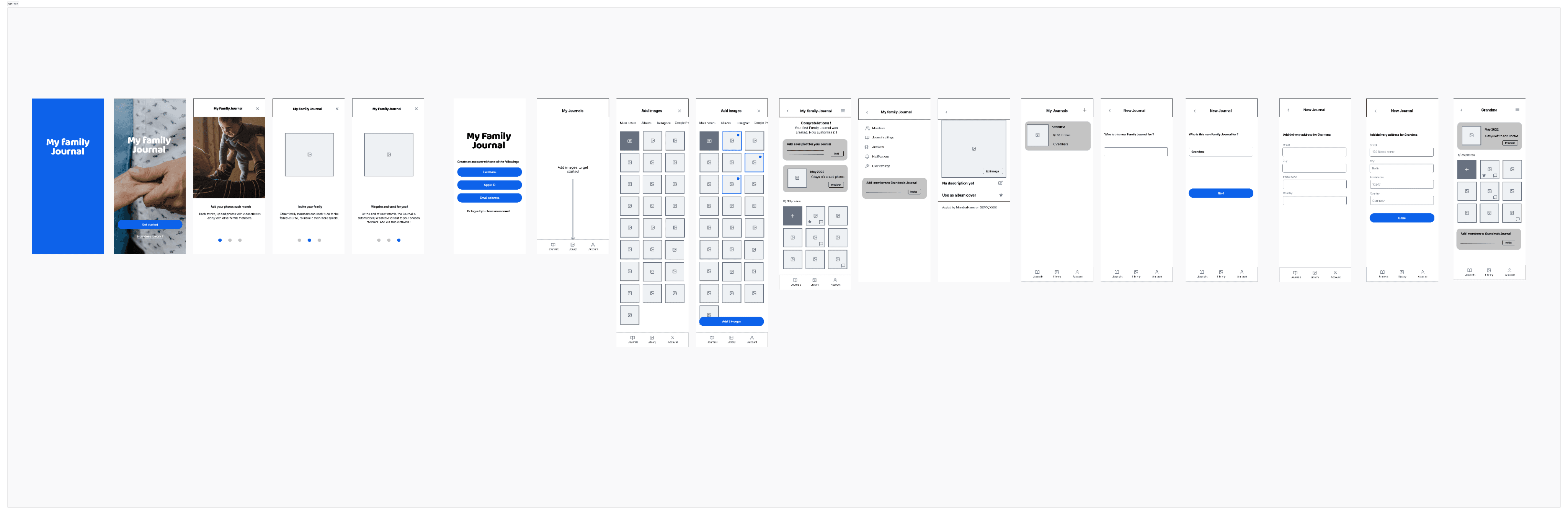
Usability study results
I did a moderated usability with 6 people based on the low fidelity prototype (remote or in person interviews).
Confusing user flow
Users are confused by the fact that the first thing they are asked to do in the App is to add images. They expect to land on a sort of Homepage first
Easier Journal creation
Users want the ability to create a journal without the need to add pictures first
Journal page lacks clear CTA
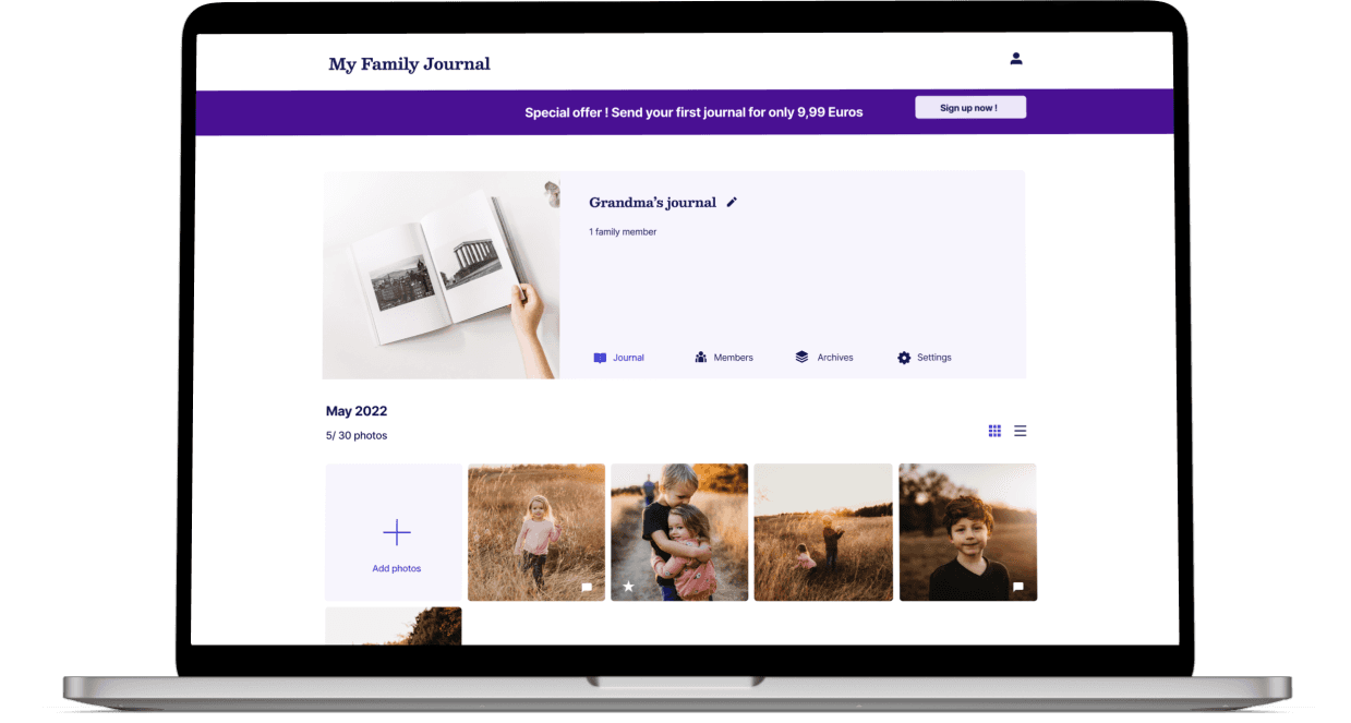
The Journal page was confusing because it had many CTAs and a lot of content. The page should be better organised and have better hierarchy.
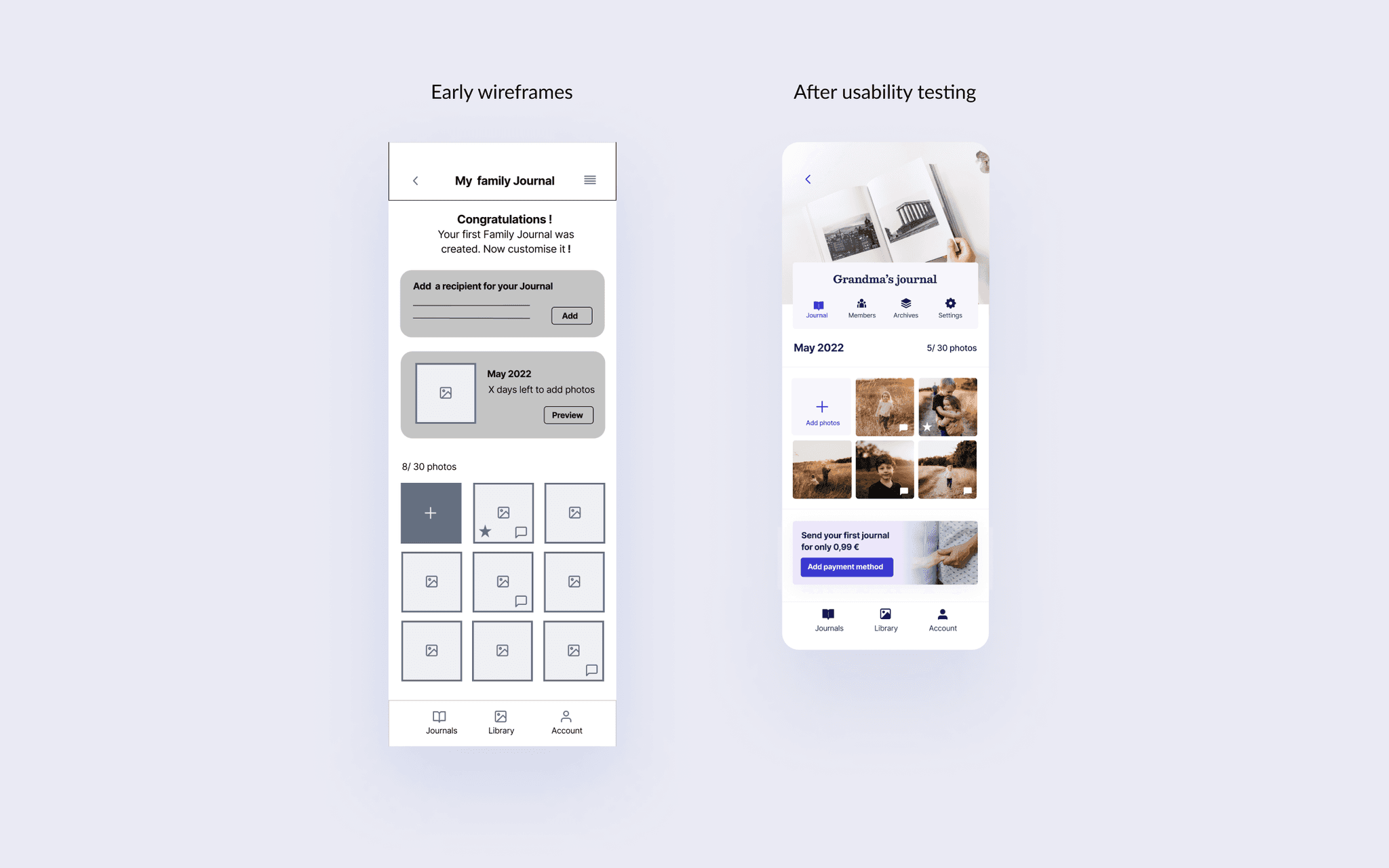
Refining the design
A high fidelity version of the App was done following the usability study learnings. For instance, instead of uploading photos during the first time use, the user is now able to create a journal and add pictures later.
Lessons learned
Give people what they expect.
In my initial “first time use flow”, users were incentivised to add pictures to quickly create a journal because I wanted to show what the App was about really fast, but during my usability testing people were confused because the Journal creation was not how they expected. Changing the flow to a more traditional experience reduced confusion and friction during first time use.
On boarding is key.
It’s always best when your product is so intuitive that people understand it right away. However, for more complex products on-boarding can be necessary. In the case of My Family Journal, adding a few onboarding slides at the beginning of the experience and in-product messages really helped to clarify the unique concept of the App.